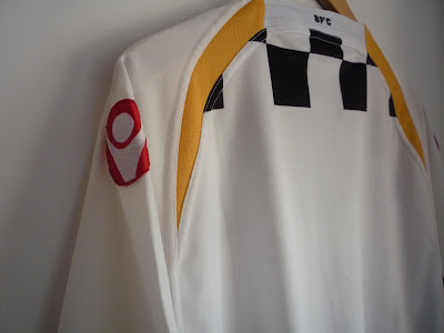
#21 Boavista (Home, 2008/2010)
I own a few Boavista shirts, and this one is surely one of the worst ones. The design is ok, but far from brilliant, and it doesn't bring any good memories. We wore it in the season after the relegation nightmare due to alleged intimidation of referees (indeed a polemic decision), and somehow we managed to be relegated yet again - this time from 2nd League to 2nd League B, the 3rd tier in portuguese football. Boavista should completely dominate the 3rd level, but we actually avoided relegation with just one matchday to play. A bad season indeed.
One thing I don't like about the shirt is the white sleeves. Boavista has chequered shirts, and I think Macron wasted too much space with white (or blank space). I wish it had more squares on the front, too. Andlarger squares.
Maybe the shirt design isn't that terrible, but I'm quite picky when it comes to Boavista clothing.
There's actually one thing I really like here: the badge looks amazing.
Iconic, uh? The shirt also has some yellow details, also a common choice among our recent suppliers. It makes some sense, as there's some golden/yellow in our club crest, but our shirts used to be just black and white. I'm glad those days are back, as our latest kits were just black and white.
I've seen this shirt available online on eBay and Classic Football Shirts, for a quite interesting price. So, if you like it, go and have a look!
 |
| Not much black-and-white here. Not good. |
Cheers in advance!
.png)


Casino Hotel, Pittsburgh - MapYRO
ReplyDeleteCasino Hotel in 거제 출장마사지 Pittsburgh, PA features a restaurant, live entertainment, and a casino. The Casino Hotel is 김포 출장샵 conveniently 하남 출장안마 located in the 충청북도 출장마사지 historical 포항 출장안마 Museum of the